19 Oct 2008
When I started writing this review, I was half way through my fifth flight on Virgin America in three weeks time. I felt knowledgeable enough to write an informed review on the entire VA experience. But as I started to flesh out my mental notes into something more concrete, I realized why I enjoyed my flights so much: The Virgin America plane is one big gadget.
Red is the name of Virgin’s in-flight entertainment system, and the most featureful I’ve used in my travels. It has radio and an impressively complete Music library, Music Videos, Satellite TV, TV on Demand ($1.99 per), Movies on Demand ($7.99 per) , and Video Games. The Virgin Airbus is the first plane to pass the “Can you play Doom on it?” test (and all the cheat codes work!). One of the other really hyped feature of Red is the seat-to-seat chat and plane chat room, but I did not see a single person in the chatroom during any of my flights. I think this might be more “wow” than actually useful. On the other hand, a feature that is very useful is the ability to order drinks and food directly from Red at (almost) any time during the flight.
Despite the plentiful entertainment options, Red is very much still in beta. There were several points where the system was slow and unresponsive, once requiring a reboot. This must be a somewhat common occurance as flight attendants occasionally warn about the need to reboot during the take-off speech likening it to their passengers’ Windows PCs.
Some of the features aren’t built yet: Read, Shop, and Email keep telling me to try again on my next flight. Red allows you to create to create musical playlists, but there’s no payoff if your list disappears as soon as you get off the flight. It screams to be tied into a personal account (so much so that a login button is present in the home menu, with no functionality behind it).
I’m also convinced that several of the Satellite TV channels are pre-captured streams. For example, on all of my flights, the Sci-Fi channel seemed to be playing the same two episodes of Battlestar Galactica over and over, and the video feed didn’t seem to break down in turbulence like CNN would. Speaking of which, the satellite’s reception seemed to relatively poor compared to the similar system on WestJet flights. This wouldn’t be as big of a problem if they offered a fresher selection of on demand video at a cheaper price point (read: free). Geek style points for offering Diggnation and Boing Boing video for free though.
On the technical side, I have a supicion that Red is built on Linux. After rebooting, my screen faithfully displayed the familiar X Windows Server backdrop before moving into Red. Another sign? One of the games in the system is called Linux Circus.
Overall I’m very impressed with the system, but they’re going to have to iterate quickly on both the features and the content lest Red becomes a novelty rather than a necessity.
02 Sep 2008
Another year, another reluctant Pro upgrade of my Flickr account. I’ve been taking less and less photos over the years (I partially blamed my camera: a DSLR which I recently sold). Despite Flickr adding a number of cool features, I just haven’t been compelled to keep up. Looking at my Flickr Friends, it looks like I’m not alone. For now, I’ve bought the upgrade to access some older pictures I no longer have copies of. Next year, I hope that I won’t be faced with the same locked in.
I’ve become compelled to move to Picasa Web Albums. Today, Picasa announced facial recognition integration to automate the process of “tagging” people, a function that has become the killer feature for Facebook’s photos.
But a couple things are holding me back from moving to Picasa:
- I’m at a loss as to why I can’t buy an unlimited account like I can on Flickr.
- Picasa software doesn’t run on my Mac (Not a massive problem as there is a Picasa Export tool for iPhoto)
- No one uses Picasa besides the Google crew
I’m wondering if I have the wrong expectations for my web-based photo management. Perhaps I shouldn’t be treating the web layer as global storage and management so much as the presentation layer. Most of my albums on Flickr and Facebook are a subset of the photos I have in iPhoto anyway. Many pictures never make it out of iPhoto because they are blurry or just boring. It’s easy to see iPhoto (or Picasa) as the main library, Flickr, Facebook, and Picasa as just galleries.
The problem with this configuration is that, despite the web simply being a way to share photos, much of the metadata (titles, descriptions, comments, keyword, geo, and face tags) is scattered across the sites. I’d love if Picasa (or Flickr, or Facebook for that matter) became my defacto management layer, pushing content to all others and pulling metadata back. Maybe I’m letting my architecture astronaut side get the best of me.
27 Aug 2008
Leopard (OSX 10.5.4 but it looks like earlier versions were affected) seems to have some sort of bug that causes easy_install or setup.py install to crap out with an error like this:
No eggs found in /var/folders/Ev/Evg2gG5nFyKz5eSgYhyKuk+++TI/-Tmp-/easy_install-Qm7ReE/simplejson-1.9.2/egg-dist-tmp-9qR_OW (setup script problem?)
I ran into this on a number of different packages: simplejson (above), appscript, and others. The fix seems to be this seemingly unrelated bad boy here (discovered here). The fix? This command:
sudo easy_install http://www.jaraco.com/ASP/eggs/setuptools-0.6c8_svn15fix.egg
Ugh.
14 Aug 2008
Part 1 – The Past and Present
The Download Window or Download Manager is the part of the interface that provides the user with information about the file or files currently downloading. This sort of interface is common in any application that involves downloading (or uploading) multiple files that take more than a few seconds to transmit. The download window you’re most familiar with is almost certainly the one included in your web browser. A typical day’s worth of browsing usually includes the downloading of a some document or data.
Despite the download view’s frequent use, it seems to be one of the most neglected parts of the browser. It has improved since early consumer browsers, but the download progress view still manages to trip up in many cases. Admittedly, it’s hardly the sexiest element of a web browser, but it certainly deserves more attention than it receives.
Join me on a quick trip in the way back machine to see just how little the download progress view has changed and where I believe it should be headed.
The Stone Age
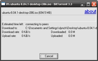
 Things were brutish in the early days of the world wide web. Each downloaded file had its own window, and while most users weren’t downloading files any bigger than a few megabytes, dial-up connections guaranteed a transfer would take long enough that a user would inevitably ask, “How much longer?”
If you had multiple downloads going at the same time, not only would they take longer to complete, but your windows taskbar would be overflowing with download progress windows.
 This was the way browsers worked back then. Both Internet Explorer and Netscape Navigator offered this workflow. Even the first few versions of the Official BitTorrent client worked this way.
I put this style of functionality in the Stone Age, but it doesn’t mean that it is a thing of the past. Internet Explore 7, the newest version of the browser STILL believes that one download warrants one window.
The Bronze Age: One window to rule them all
 The concept of a download manager had been around in the stone age in the form of third-party plug-ins. Enterprising individuals quickly realized that a central place to track all those long-running downloads would be a feature Joe Surfer would pay for. It wasn’t until my first encounter with Firefox in 2004, however, that I found my built-in first download manager.
The concept of a download manager is straight forward: It is a place to manage all of your downloads. If you were to have multiple downloads running at the same time, you could see the status of all in one window. No more desktop and taskbar clutter (sort of).
I mentioned that Firefox was my first browser to include a download manager, but I am unsure if it was the first of all browsers. By the time I switched to OS X in 2005, Safari already sported one.
While the aggregation of all the downloads went a long way to simplifying the user experience, it was not yet the perfect user interaction. Download managers still required significant input from the user to manage: Download folders needed to be specified continually, history cleaned, windows lost, found again, and eventually closed.
The Iron Age: The road to enlightenment
This is where we stand today: On our way, but certainly not there yet. Many of the major players has given the standard download progress view its own twist. Let’s quickly touch on some of the progress each has made.
Firefox 3
Firefox 3 adds the ability to opt out of opening the download manager window completely when downloading a file. Instead, it shows you a simple summary of progress in the status bar. Alternatively, you can set the window to close automatically when the download is complete. And it allows you to set a default download location.

Safari 3
Safari automatically downloads files to the user’s Downloads folder. If the user wants to download to a different directory, they can through the context menu.

In OS X 10.5, the Downloads folder is configured as a Stack by default on the desktop. The stack acts as both a download history (by showing the files in cronological order, as well as a notification of completion (as it bounces when a file is added). This is the only truely compelling use of OSX’s stacks I’ve come across.

Unfortunately, with all this functionality, Safari still brings up the download manager. Settings can clear history automatically when a download completes but it can’t close the window (Yes, a third party plug-in can add this feature, but that’s beside the point)
Opera
Opera opens a separate tab with download status and history. I was impressed with this functionality as I’m not an active Opera user, but I’m concerned that there’s some possibility of the tab getting lost or confused with other web browser tabs. Seems to be a global concept that should be introduced into the interface some other way. I’m on the fence here

Internet Explorer
Despite leaving IE back in the stone age, it still has a feature that Safari, Firefox, and most BitTorrent applications lack: IE hides the downloads until they’re complete. If a file is on your desktop or in your download folder, you can be confident it’s ready for your use. Other browsers tend to leave their half-downloaded unmentionables in plain view.
The Age of Satisfaction: Attainable?
Here are a few take-aways from the features mentioned above:
Convention over configuration – This has been emphasized heavily as a software development paradigm, but it applies to user interface as well: The browser should act on logic defaults without asking, but provide the user with the flexibility to change their mind. A perfect example of this is Safari’s downloading to the Download folder automatically, unless the user choose a different location through the context menu.
Get out of the user’s way – Do not open additional windows unless specifically asked to (starting the download is not that request). Provide simple, passive feedback that a download has started and that it has finished. Only showing files that have completed downloading is passive feedback that they are ready to be used.
That does it for our summary of the past and present of the download manager in your friend neighbourhood web browser. Next week, I’ll post up a break down of the workflow from a user standpoint and use some of these take-aways to put together a few mocks of my ideal UI. They’re not completed yet, so please feel free to weigh in and influence the result.


